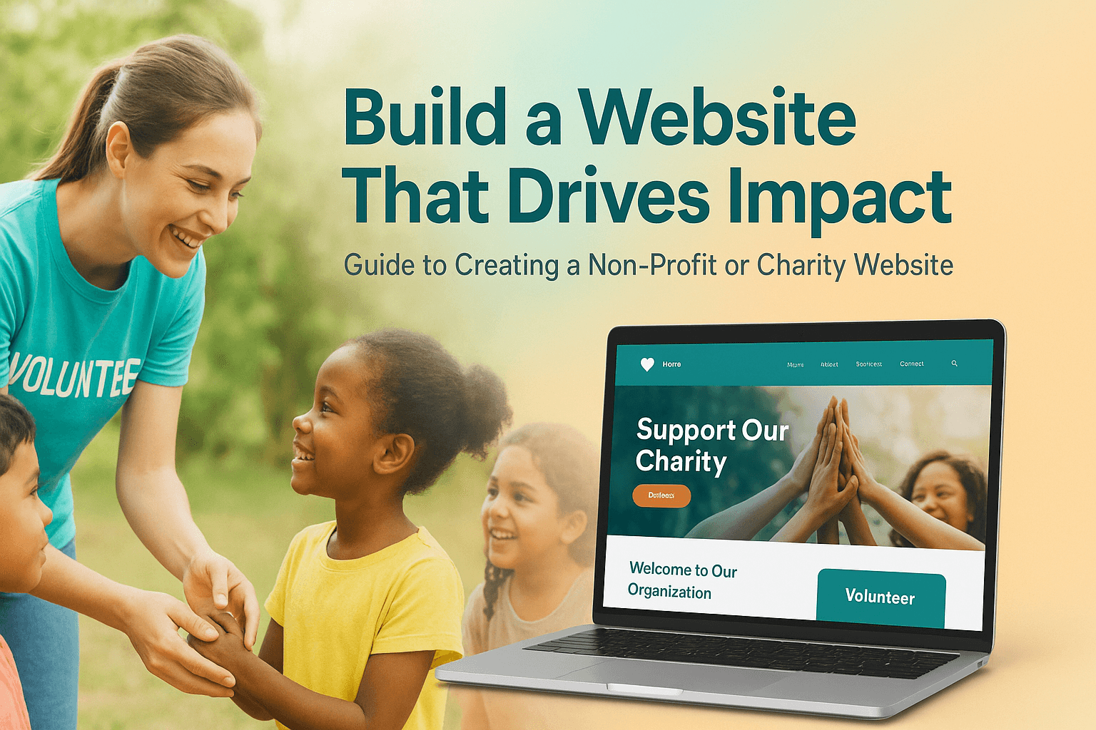
Over 60% of people now give money to charities online. That’s a big change. Also, more than 75% of people will look at a charity’s website before they decide to give or help. So if you're trying to build a charity website in 2025, having a good one is really important.
Your website isn’t just a place with information. It shows who you are and what you care about. It helps people trust you. It makes it easy for them to give money, sign up, or join your cause. Whether you’re starting a new charity or want to reach more people, knowing how to create a charity website can help you grow and do more good.
We know many charities don’t have much money or staff to build websites. We’ve helped others like you—people with big hearts but small teams. Some had old websites, some didn’t know where to begin. That’s why we made this guide. It will show you how to make a charity website step by step, using tools that work and words that make sense.
📣 Need expert help before you start? Book a free 15-minute discovery call with our team
In a 2024 report by Classy, 63% of donors said a nonprofit’s website helped them decide to give. Another study by Nonprofit Tech for Good found that more than half of online donations come from mobile phones. In other words, if your website is hard to use, you may be losing support.
At Digital Crafters, we have spent over 10 years helping charities build websites that do more than just exist. We know what works—and what does not. If you are wondering how to build a charity website that makes a difference, start here. The best sites we have seen share these five qualities:
If your site is messy, people will leave quickly. A clean layout with clear menus makes a big difference. Real photos or short videos help people feel your cause. When they feel connected, they are more likely to help.
Do not make people guess what to do. Whether it reads “Donate Now,” “Join the Cause,” or “Volunteer Today,” choose your goal and make it clear. Keep that button in the top-right corner, always.
🔎 Pro Tip: Charity sites with a donation button at the top get 38% more clicks.
People want to know where their money goes. Use numbers, true stories, and evidence. A clear “What We Do” page, with yearly updates or financial reports, shows that you are serious and trustworthy.
Most people will visit your site on a phone. If your site is slow or does not fit the screen, they will leave. Make sure every part of your site works well on any device.
Giving should be simple. Use platforms like Donorbox, Stripe, or PayPal to make donations smooth. Let donors choose one-time or monthly gifts. Keep your forms short so people can quickly give.
A 2023 study by Donorbox showed that charities with a clear website plan raised 32% more money online than those without one. That tells us something important: before you build a charity website, you need to make a plan. A good plan helps you get more support and fewer problems later.
Here are three easy but important steps to take before you create a charity website:
Ask yourself these questions:
When your message is clear, people understand you better. You won’t leave them guessing.
Think about the people who will visit your website:
If you know your visitors, you can use the right words and write the right pages for them.
The best charity websites usually have these pages:
Don’t add too many pages. Keep it simple. Each page should help people take the next step.
📣 Need help planning your pages? Get our free sitemap template.
More than 70% of charity websites are made using simple website development platforms like WordPress, Wix, or Squarespace, according to a 2024 Tech for Good report. These tools are popular because they don’t cost too much, are flexible, and are not hard to use. But the right choice depends on what you want, how much money you have, and if someone on your team can help with the tech side.
At Digital Crafters, we’ve helped many charities build websites using different tools—from easy blog-style websites to sites that help collect online donations. After working on many projects, here’s a quick look at five common tools used to build a charity website:
| Platform | Pros | Cons | Best For |
| WordPress | - Highly customizable - Thousands of plugins - SEO-friendly | - Steeper learning curve - Requires updates & security setup | Medium to large nonprofits with tech support |
| Wix | - Easy drag-and-drop builder - All-in-one hosting - Quick setup | - Limited flexibility - Not ideal for scaling | Small nonprofits or solo founders |
| Shopify | - Great for donation products or merch - Built-in payment system | - Monthly cost - More eCommerce-focused than content-driven | Nonprofits selling products or tickets |
| Squarespace | - Clean templates - Built-in tools - Good for storytelling | - Less flexible - Limited plugin ecosystem | Visual storytelling and simple donation sites |
| Webflow | - High design control - No-code customization | - Higher learning curve - May need developer help | Design-focused orgs with tech staff |
🧠 What We See: “Most of our charity clients pick WordPress because it lets them do more. But we also use Shopify when the donation process needs to work like an online shop.”
A 2024 report says more than half of donors like to give money online. Many young people also check a charity’s website before they decide to help. If your website is not easy to use, you might lose donors.
Here is a simple guide to help you build a good charity website. We also share some tools that can help.
Choose a website name that is close to your charity’s name (like yourcharity.org). This makes it easy for people to find you.
Good places to host your website (with discounts for charities):
Make sure your hosting has:
We suggest WordPress for most charities because it is easy to change and has many useful tools.
How to start with WordPress:
Your theme shows how your website looks. It should work well on phones, support donations, and look clean.
Free Themes:
Premium Themes:
Your content should be simple, emotional, and action-focused.
Must-Have Pages:
📝 Quick Tip: Use short headlines, active voice, and bullet points for clarity.
Don’t just use PayPal. Use tools made for charities that can take repeat gifts and work well on phones.
Top Donation Tools (with pros):
🛠️ Expert Insight: “We helped an education NGO increase online donations by 63% just by optimizing their donation form UX.”
SEO helps people find your website. Tracking shows what works.
Install:
🔍 Optimize titles, add alt text to images, and use internal links.
Many people use phones to visit your site. Making your site easy to use helps build trust.
Quick WCAG Checklist:
📣 Need help building your nonprofit website from start to finish? Get a free custom quote.
According to the M+R Benchmarks Study, websites that prioritize user experience see up to 84% higher donation conversion rates. Good design isn't about looking flashy—it’s about guiding visitors to take action without confusion or delay.
Here’s how to structure your charity website for impact and results:
People process visuals 60,000x faster than text. Use authentic images to show your mission in action:
Avoid stock photos when possible—real images build emotional trust and connection.
Your call-to-action—Donate Now, Get Involved, Sponsor a Child—should appear on every page, ideally in the top navigation and at the end of scrollable content.
Sticky buttons or banners can boost visibility without being intrusive.
Every extra click can reduce conversion. Keep your donation forms short and frictionless:
One-page checkouts consistently outperform multi-step donation processes.
Visitors are more likely to give when they see others doing the same. Add:
Use logos, names, and real stories—credibility matters.
A well-structured website isn’t just a digital brochure—it’s a fundraising engine. According to Classy’s 2024 nonprofit trends report, organizations that invest in website improvements see an average 126% increase in online donations within six months.
Here are two real examples from our recent work that show what’s possible with the right technology and design strategy:
Website: https://charlesbuttfdn.org/
Overview:
The Charles Butt Foundation focuses on strengthening public education in Texas. They needed a mobile-optimized site that could effectively showcase research, community investments, and media assets while staying donor-friendly.
What We Delivered:
Results:
"The UX clarity and impact-first design made a real difference in how people engaged with our mission."
Website: https://www.21iqinnovation.org/
Overview:
21IQ Innovation supports youth entrepreneurship and STEM access in underserved communities. They needed a modern, engaging website to highlight programs, drive event signups, and accept donations online.
What We Delivered:
Results:
“Built in under 4 weeks, the platform now tells our story in a way that motivates action.”
📣 Want to be our next success story? Let’s talk →
A recent survey by Nonprofit Tech for Good found that 60% of potential donors leave charity websites because they are hard to use, have old information, or don’t feel safe. These mistakes happen a lot, but you can easily avoid them.
Here’s what to watch out for:
If your website doesn’t have HTTPS, browsers will warn visitors that your site is “Not Secure.” This scares people, especially when they need to enter personal or payment info. Most hosts offer free SSL certificates, and setting one up takes just minutes.
More than half of nonprofit visitors use phones or tablets. If your site is slow, the text is messy, or buttons are too small to tap, you’ll lose visitors and donations. Make sure your site adjusts to any screen and test it often on mobile devices.
If visitors have to search for how to give, many will give up. Your donation button—like “Donate Now” or “Support Us”—should be easy to spot, stay at the top of the page, and stay visible as people scroll. This simple trick boosts donations.
Trying to say everything at once can overwhelm visitors, making them read nothing. Keep your homepage simple with one clear message, a few strong images, and one or two clear calls to action. Link to other pages for more details.
Donors want proof that their gifts make a difference. If your site doesn’t show recent results, stories, or financial info, people may doubt your work. At a minimum, share an annual impact report and keep your success stories fresh.
✅ Quick Tip: Check your website every few months to update donation links, content, and security.
In 2025, nearly 80% of donors say a charity’s website shapes their choice to give. Your website is more than just an online spot—it builds trust, tells your story, and shows the real impact of your cause.
A well-made site helps you connect with supporters, prove how their gifts change lives, and invite them to keep being part of the journey. Don’t let tech worries slow you down. With the right help, building a strong charity website is within your reach.
The price changes a lot depending on what you want. A simple website on WordPress or Wix can cost between $500 and $2,000. More complex websites with special donation tools can cost from $5,000 to $20,000 or more. Many charities can get discounts or help to pay for websites.
Yes! WordPress, Wix, and Squarespace are easy to use and don’t need coding. But hiring experts can save time, keep your site safe, and help you get more donations.
Good choices are GiveWP, Donorbox, and Stripe. GiveWP lets you change many things and see reports. Donorbox is easy and lets people give every month. Stripe is safe and works with many tools.
Shopify is good if your charity sells things to raise money. It is safe and can be changed to fit your needs. But if you want to focus on donations, WordPress with special donation tools may work better.
You must follow privacy laws like GDPR or CCPA if you collect personal information. Your site needs clear privacy and refund rules. You must keep payment information safe with SSL. Also, show your charity’s official registration and tax-exempt papers if needed.